Translate Afterpay’s buy now, pay later strengths into money features that feel trustworthy and worth trying in a crowded everyday spend market.
Role
Design team lead
(4-designer team)
Timing
16 weeks → MVP
Impact
Propensity to try score increase
Mission
Find an ownable way for Afterpay to enter everyday money management.
Constraints
- Tech stack decided
- Base build in flight
- Exec pressure to launch
- Marketing pressure to differentiate
- Strong protection of the core BNPL business
Key calls
- Launch an invite-only pilot to build trust
- The first best customer to target
- Prioritising launch features that boosted trust first
The situation
Before its acquisition by Block, Afterpay had its sights on banking. We joined as they were rapidly establishing a core product team, building baseline mobile-banking functions, and lining up marketing and support ahead of launch.
The tension in the ambition
The buy now, pay later market in Australia in FY20 had tripled to A$10 bn, yet it was still just 2% of all card spend. 98% of the space was still elsewhere.
Consumers loved the extra spending power; Afterpay posted an NPS of +53.6 vs the big four banks’ +2.1. But users were also taking on debt they could not absorb.
- 1 in 5 users missed a repayment last year
- 84% of financial counsellors now see BNPL debts in hardship cases
- 61% say clients cut food or rent to keep accounts open
Why this matters
If Afterpay’s next act is everyday money management, it has to address these trust issues head-on. If they cannot turn financial anxiety into genuine trust, their permission to play in that space will be lost.
Our job
Open a path for Afterpay into the everyday money transaction space with an experience that can grow without exhausting the people it serves.
Framing the challenge
How do we earn permission for Afterpay to play in everyday money?
Where we started
"I probably wouldn't want to have it as my banking app to be honest... If you're in the mindset where you're trying to save for something, it's not great, it could really tap into bad habits."27 yo concept tester, AU
Making progress
"I probably wouldn't use it instead of Up just because I've been with them for so long, but I'd use it as an extension of what I'm already using..."25 yo concept tester, AU
The shift
“The story part is brilliant, it’s so different from conventional banking apps. It gives you assistance in context, which provides a good, positive mental aspect33 yo concept tester, UK
"I really like it. It's more pressure on the big 4 to just not be shitty. I feel like this is really interesting with Afterpay getting involved in the banking side of things."28 yo beta tester, AU
What moved the needle
Two things shifted perception: a relatable device that allows you to see your money, and a quick sense-check on how you were tracking.
Personalised data stories
A reels-style playback that turned your transaction history into the story of your money. It surfaced where your money flowed, recognised good behaviour, and nudged you toward the next small step.
Colour as a quick money temp-check
A one-glance money check; warm for spending, green for income, purple for saving.
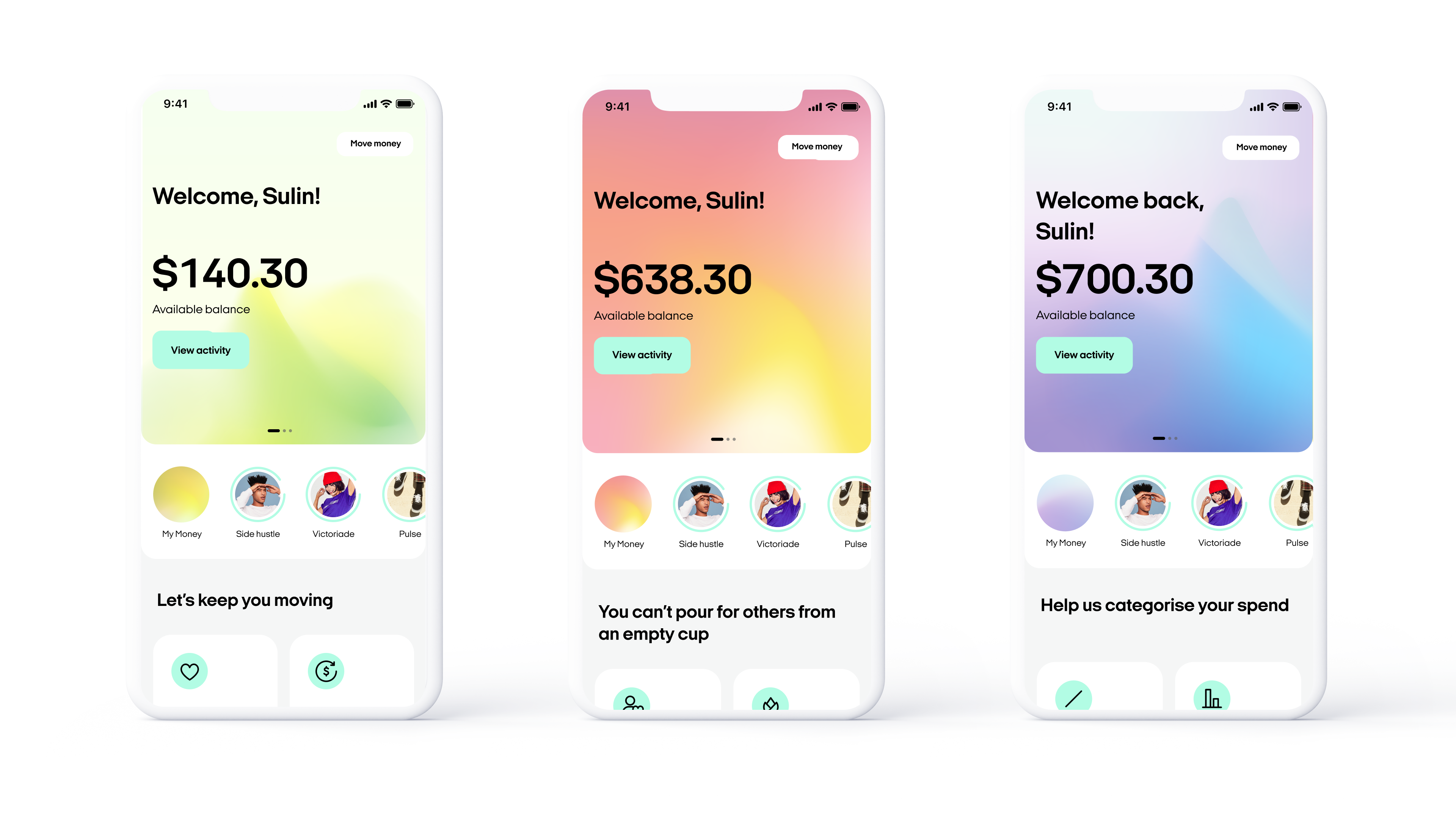
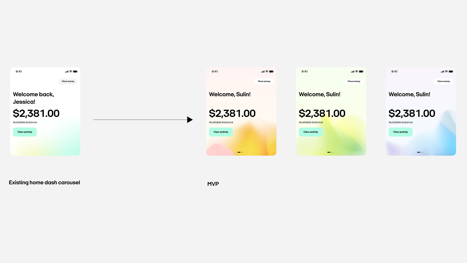
These two elements became the backbone of the invite-only pilot and were central to the 120% increase in propensity to try compared to earlier, more conventional concepts.
Process breakdown
Research, focus, and hypothesis
Deep audience understanding
We explored how people relate to money, their general well-being, and their financial well-being.
Managing money looked like an ecosystem; no single institution, app, or tool rules it all. People assemble their own stacks that flex with context and ambition.
Behaviour spectrum and first best customer
We plotted a spectrum from “avoiding money” to “highly structured and supported.” At one end, people already had solid systems; at the other, people were not ready to engage.
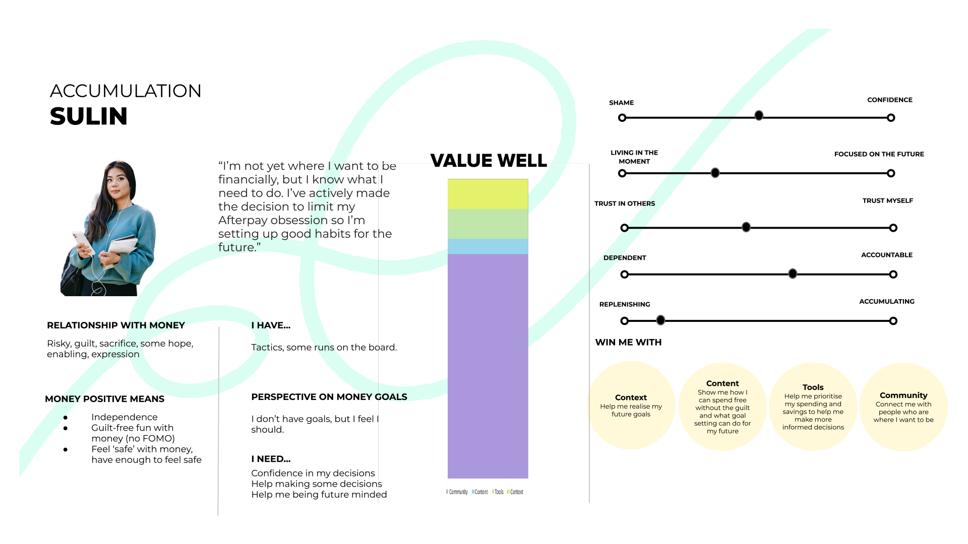
We focused on the middle; intrinsically motivated people who wanted to do better with money but needed more confidence and self-trust.
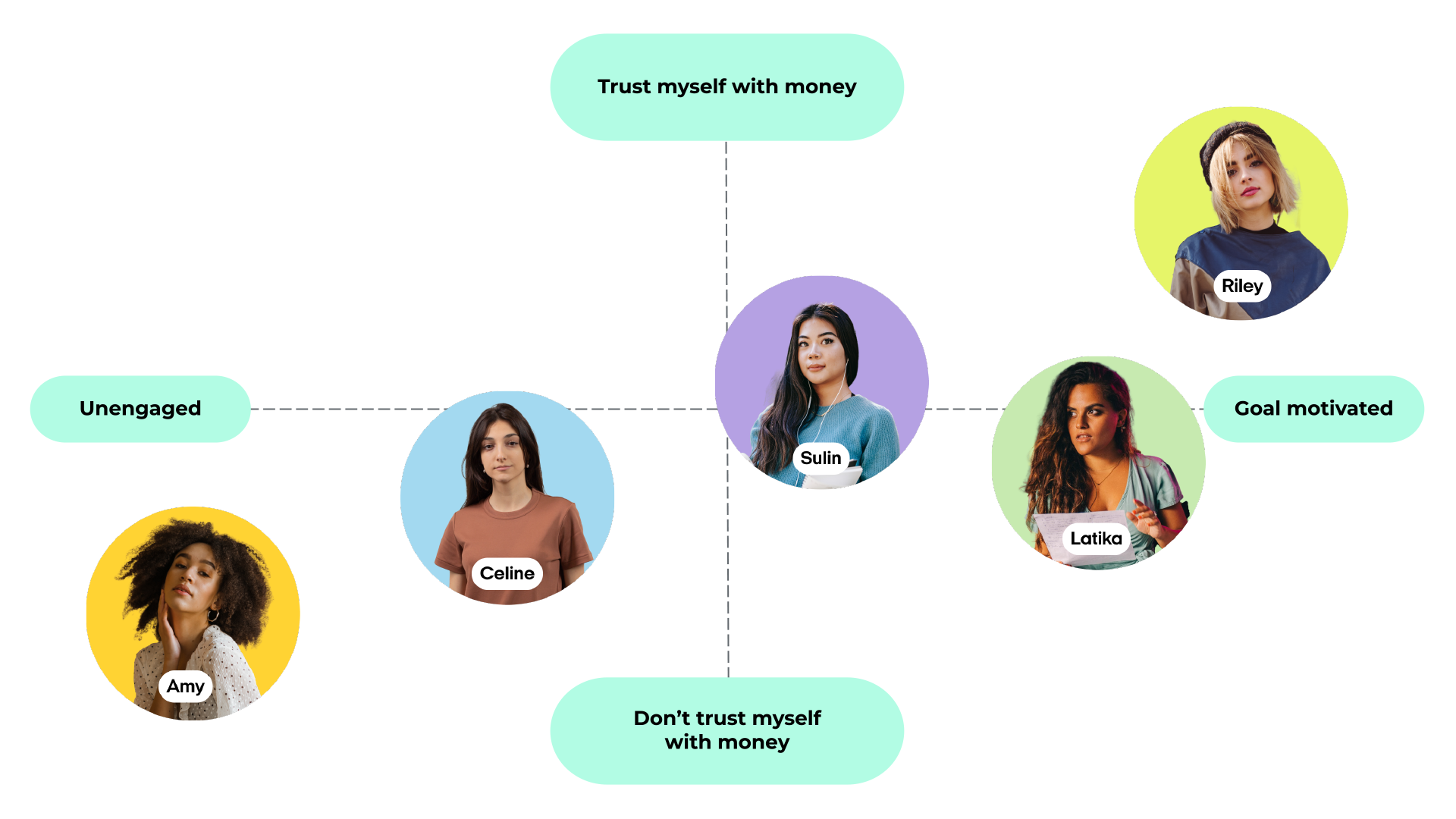
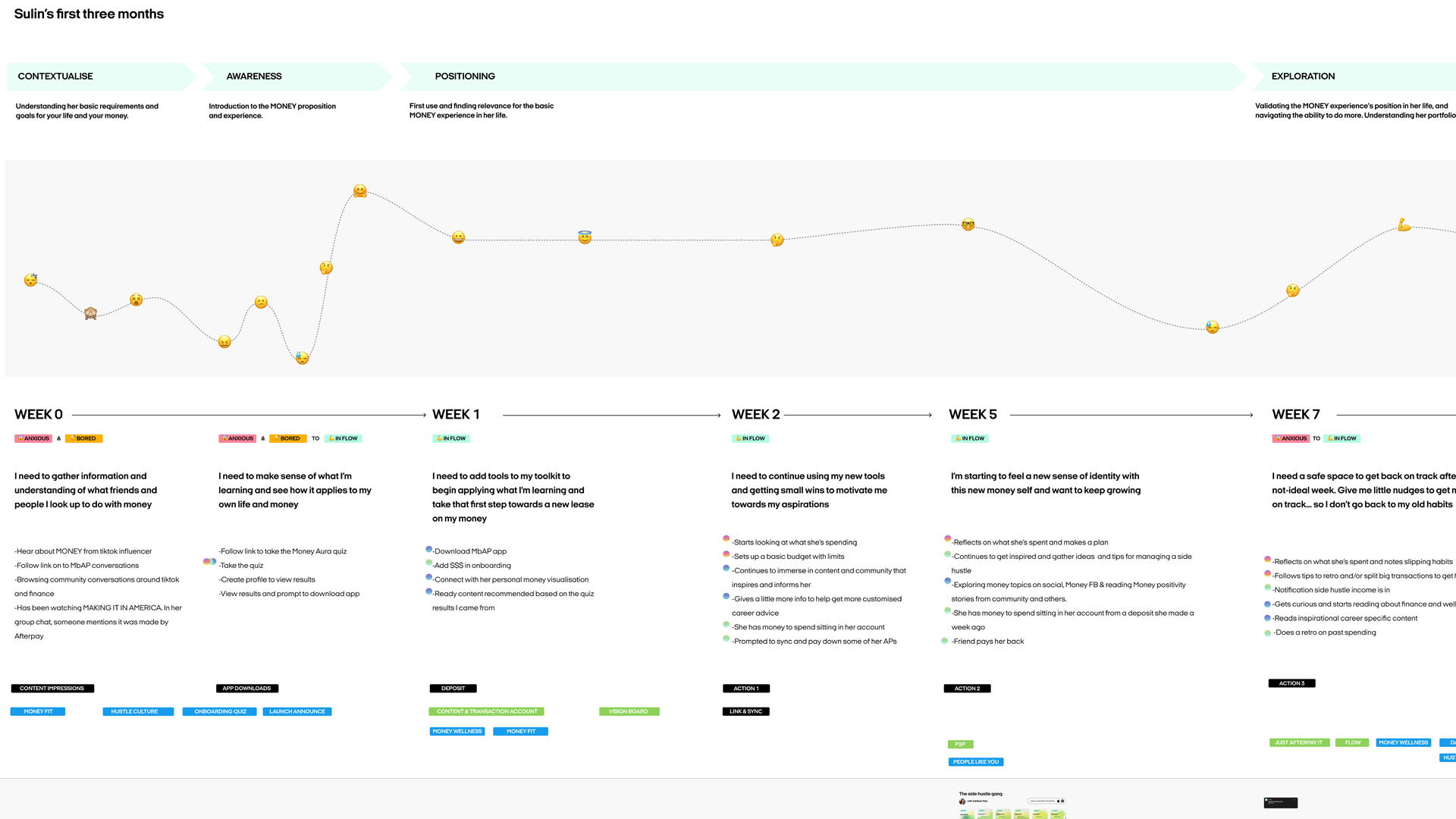
We captured this in a primary persona, Sulin, who had the intent but not yet the confidence or tools to feel in control.
Entry point
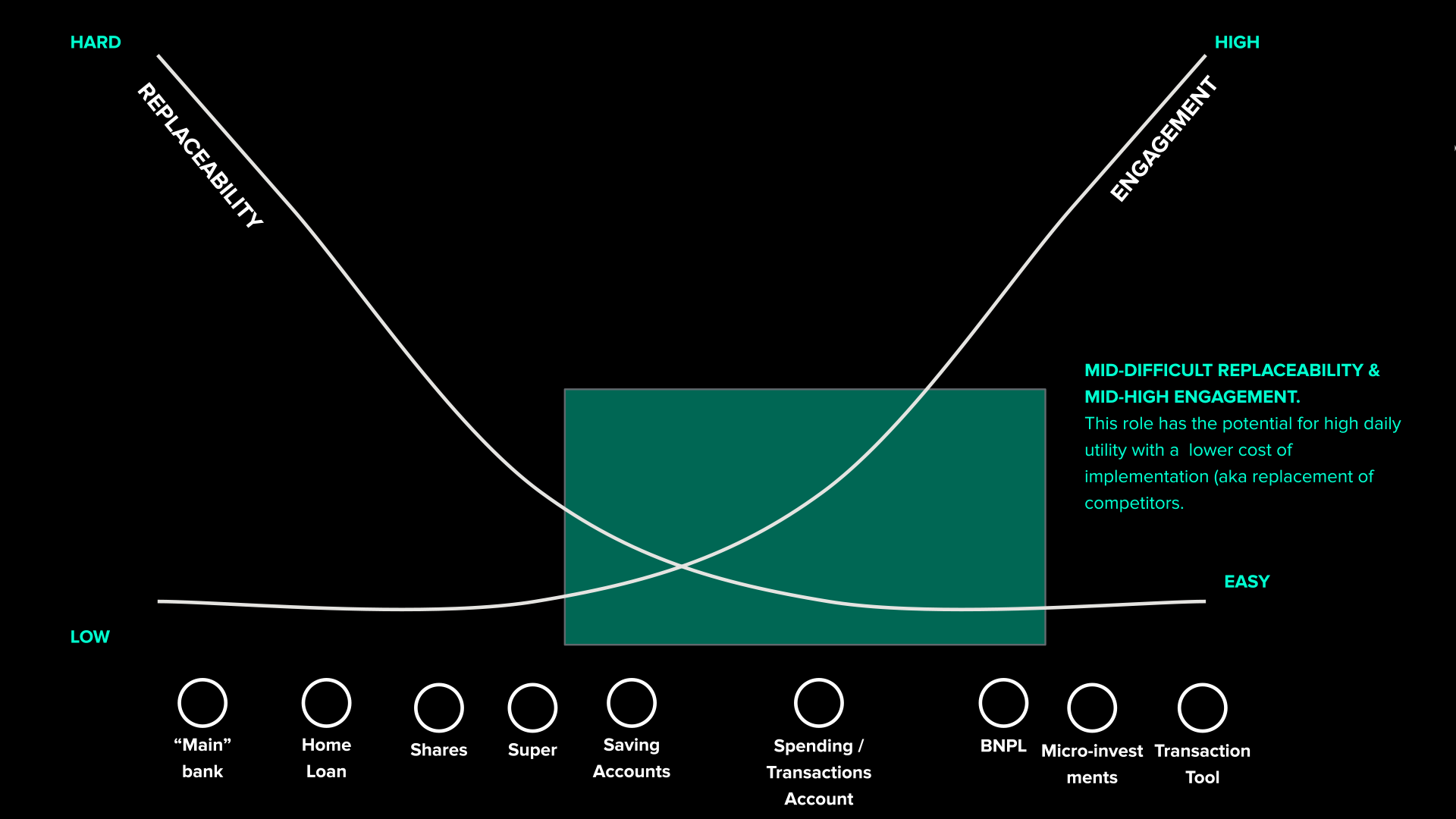
We mapped services against engagement and replaceability. Salary accounts were deeply entrenched. Top-up tools and side savings were easier to switch. That became the natural entry point; earn trust without asking people to uproot everything.
Strategic positioning
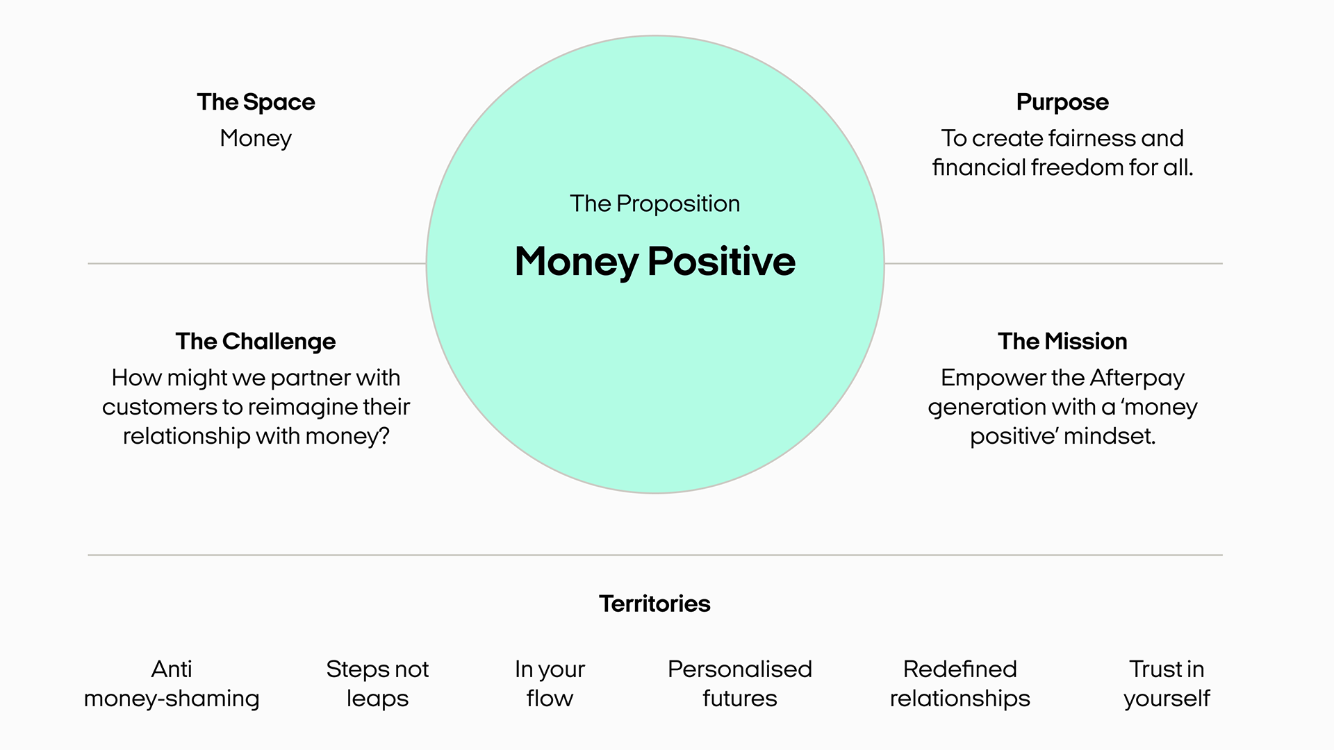
Redefining the mission
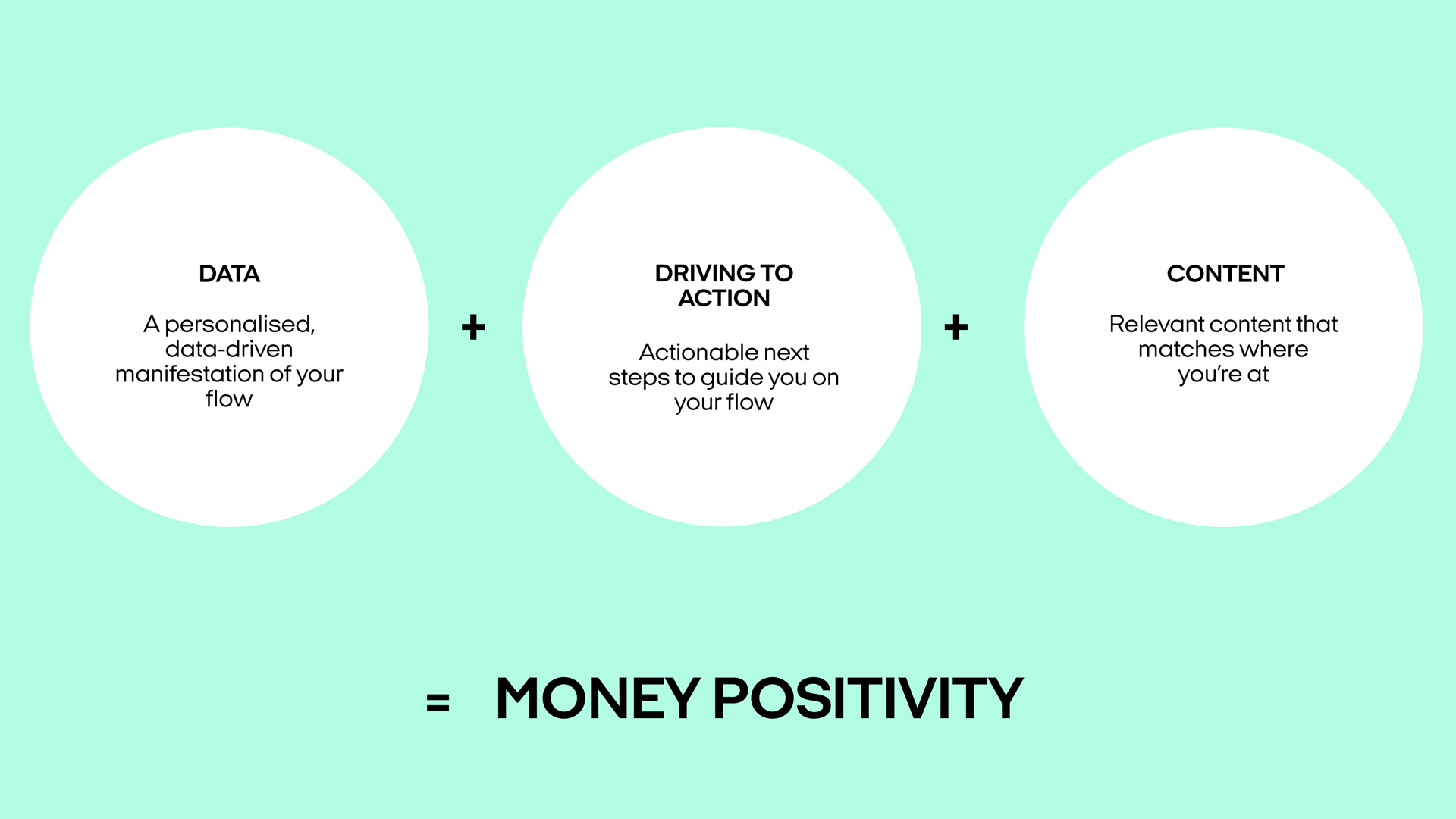
Help people build a healthier relationship with money through personalised guidance, not generic rules. Balance emotional and rational needs so confidence grows with capability. We framed this as a “money-positive” mindset.
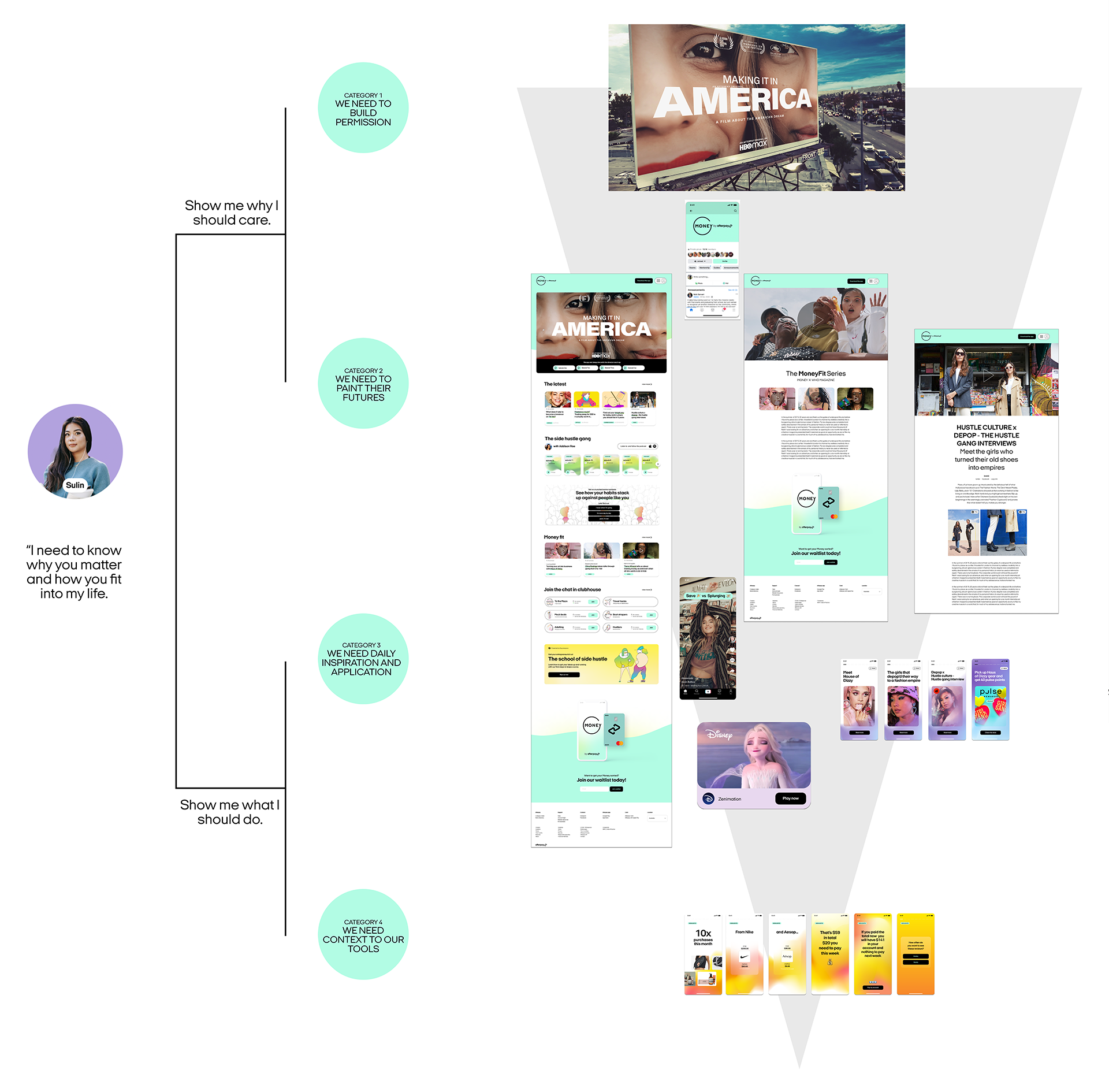
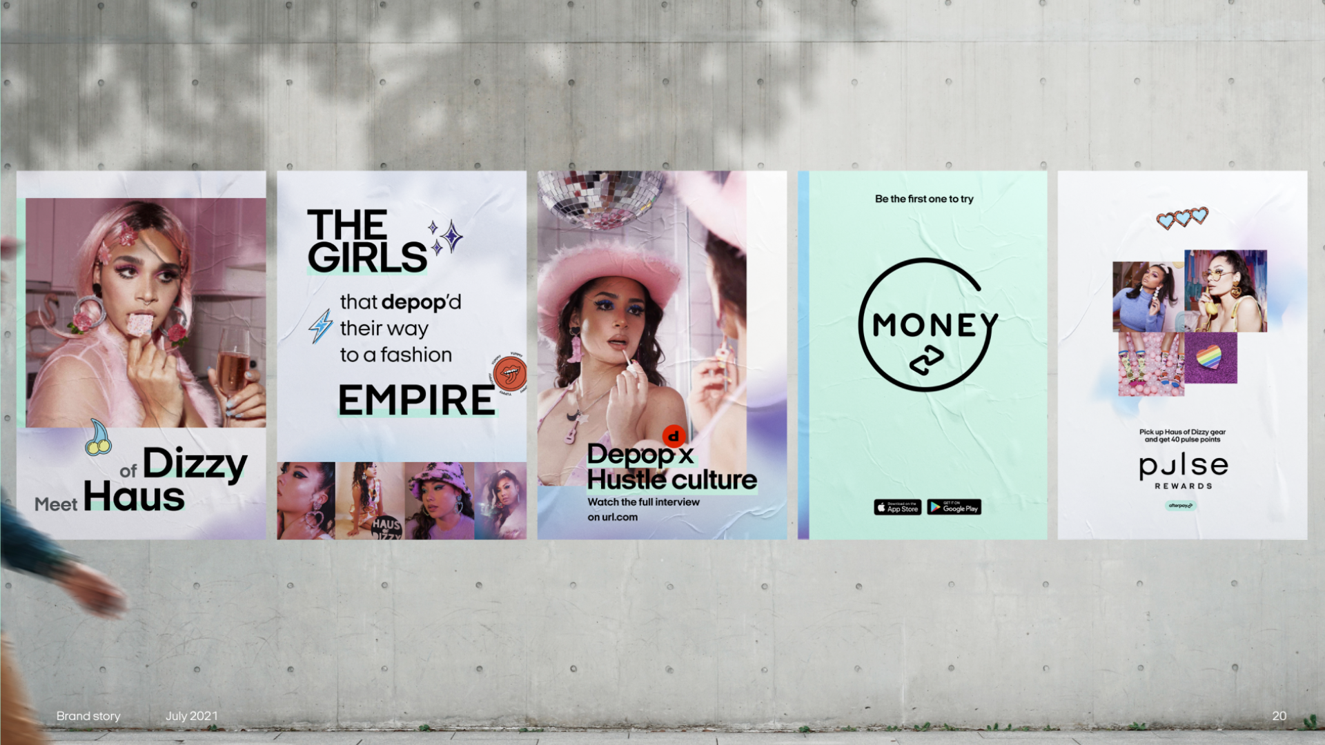
From out-of-app to in-app
To shift behaviour, we had to show up where people already were; in feeds, on streets, and inside the app. The same story needed to stretch from marketing to product without breaking.
First 90 days and MVP
We mapped Sulin’s first three months, from first contact to early wins. That journey anchored which features, stories, and prompts made it into the MVP, and which stayed aspirational.
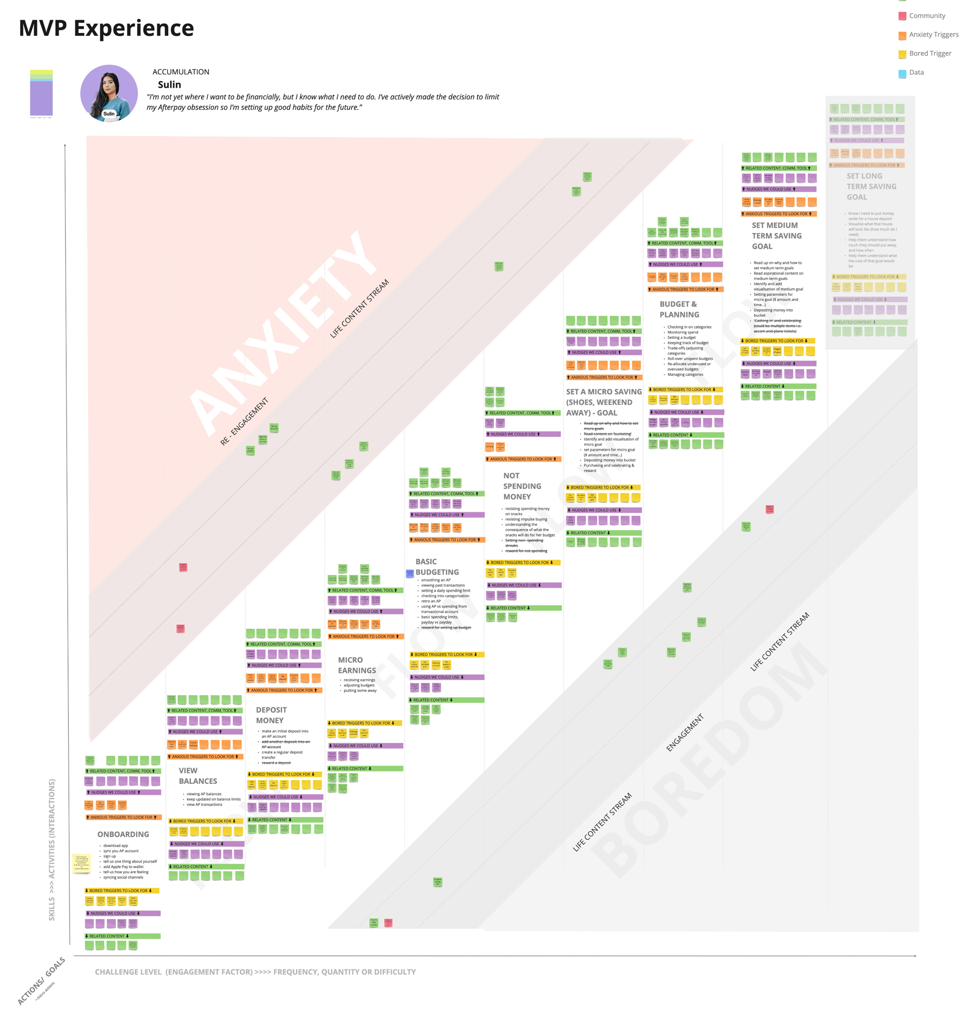
Designing the system
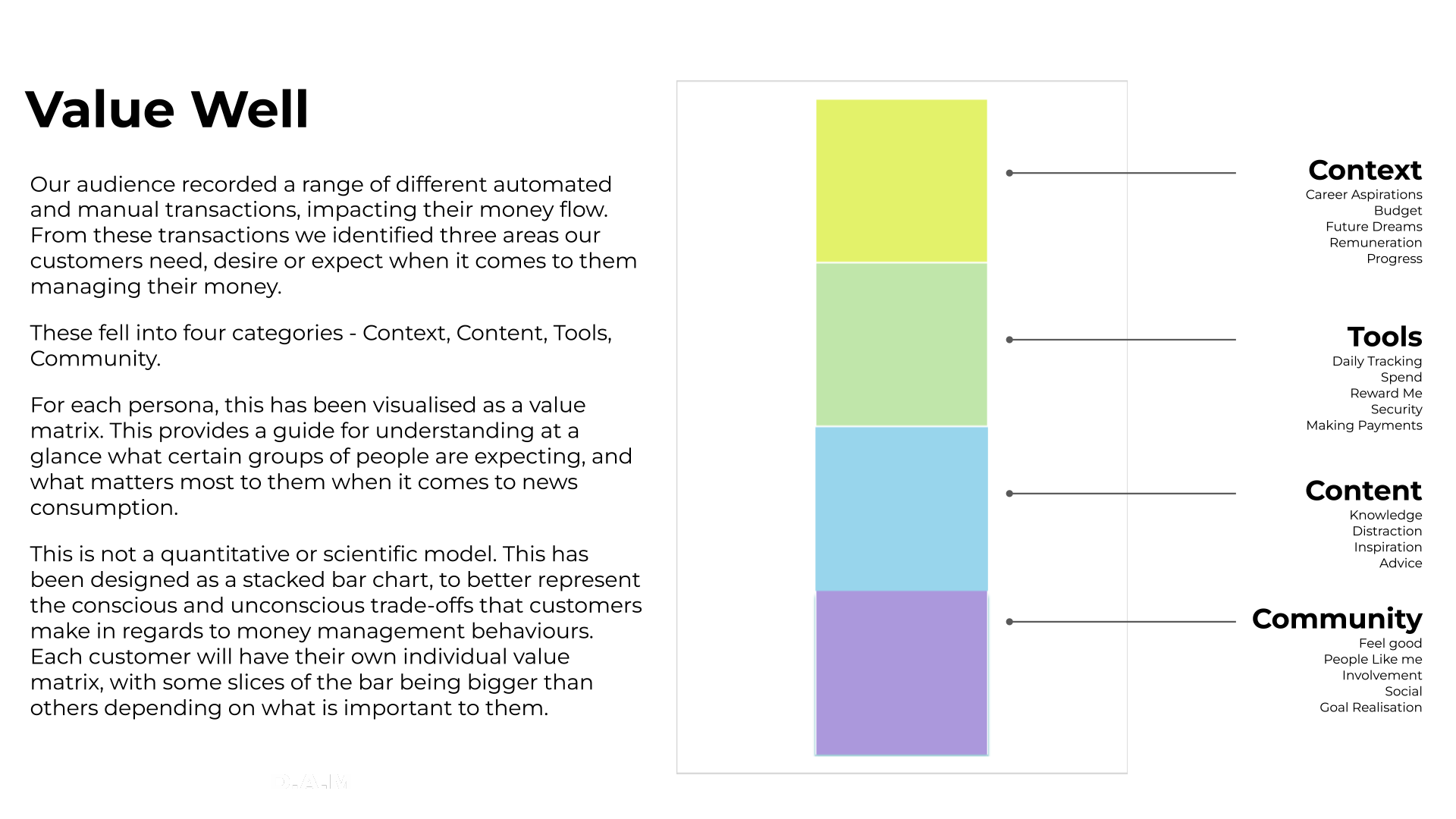
Balancing facts and feelings
Being strictly factual about money is necessary, but not enough. Too much “story” and you lose reality. We developed a framework to balance rational and emotional storytelling so people could understand their money, tell their own stories, and hear others’.
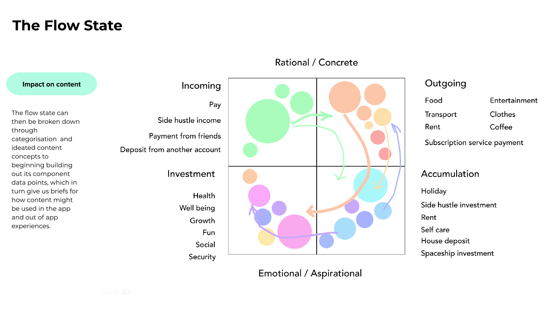
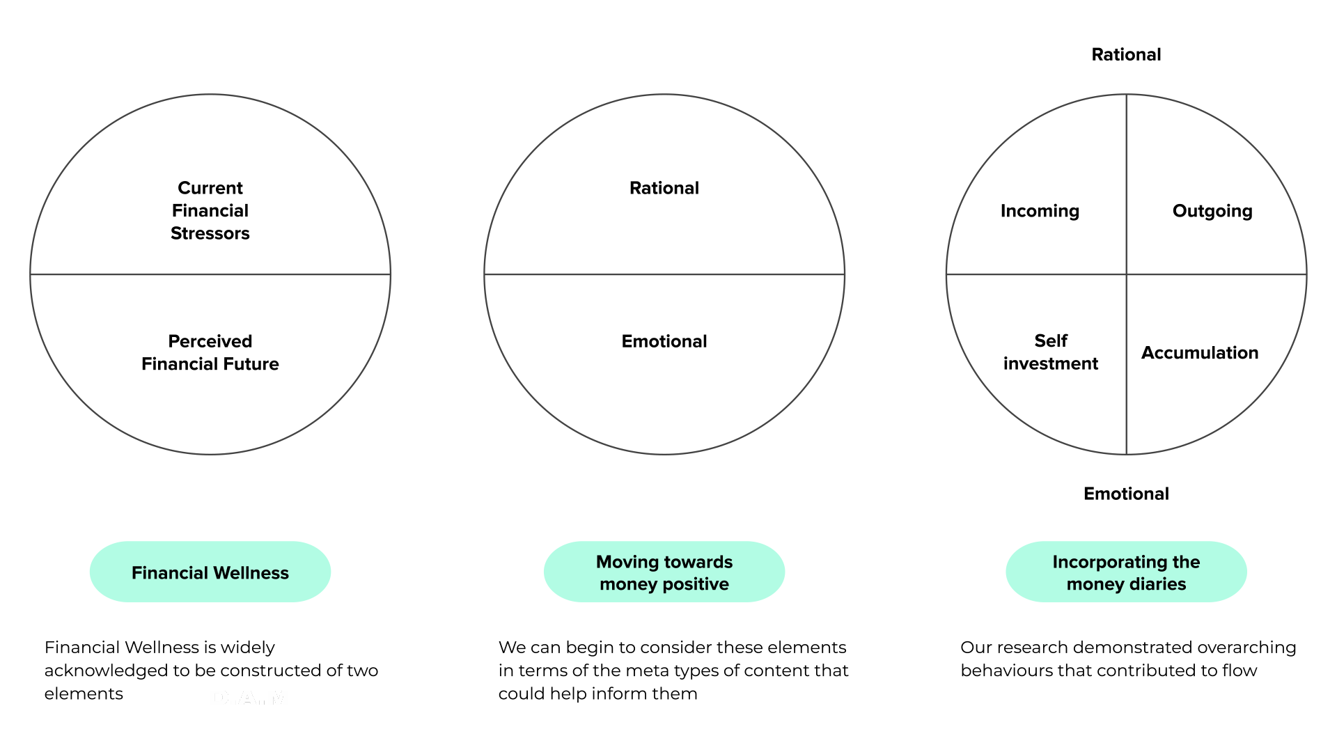
From framework to system
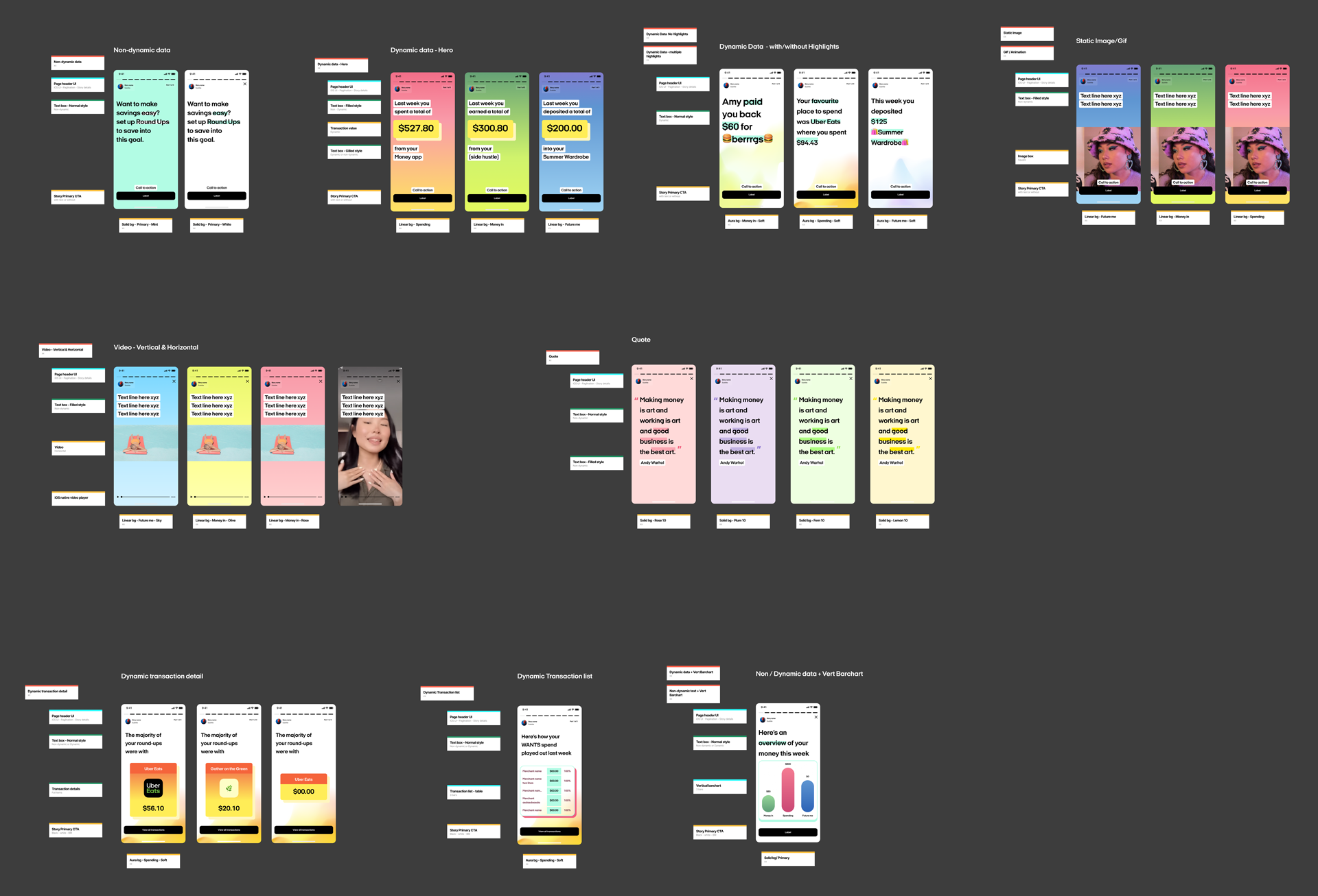
The framework became a system that made money feel more legible and less judgemental.
Key elements:
- Visual tools that turned complex flows into simple, readable patterns.
- Narrative moments that showed progress and surfaced stories without drifting into shame or fantasy.
- Personalised prompts that encouraged small, repeatable behaviour changes aligned with long-term stability.
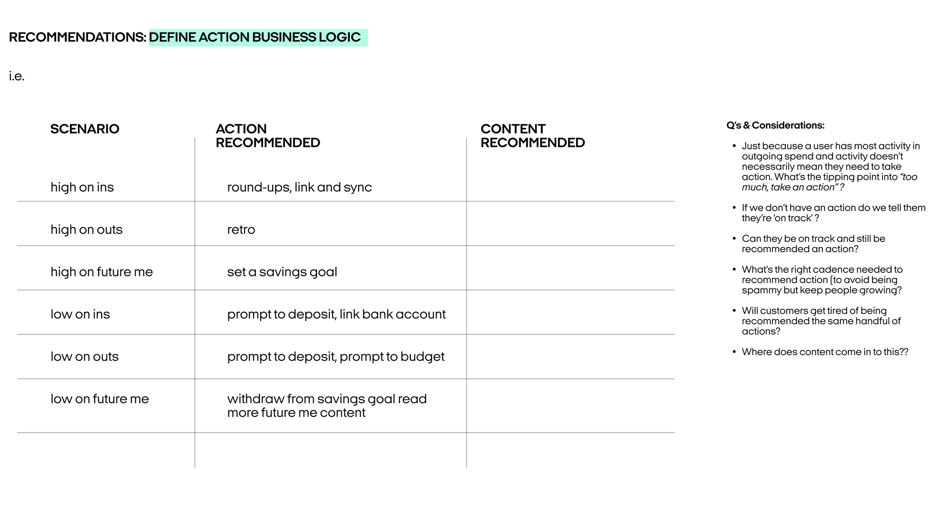
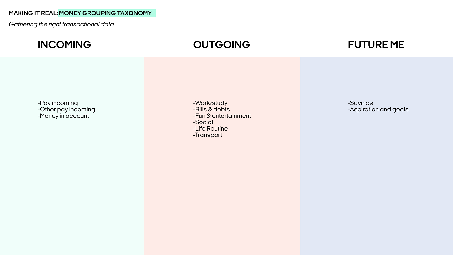
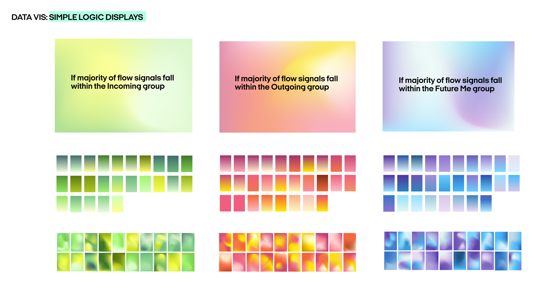
Taxonomies and visual logic
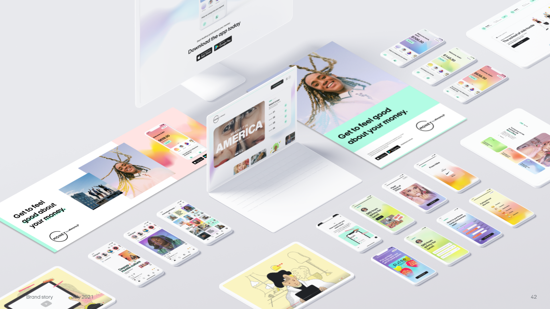
Delivery and expression
Templates and real-world touchpoints
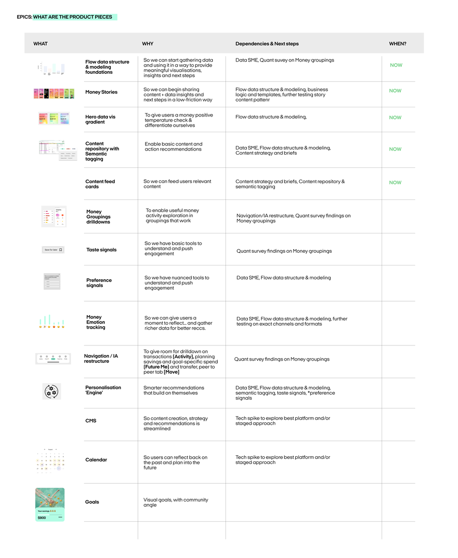
The cutting room floor
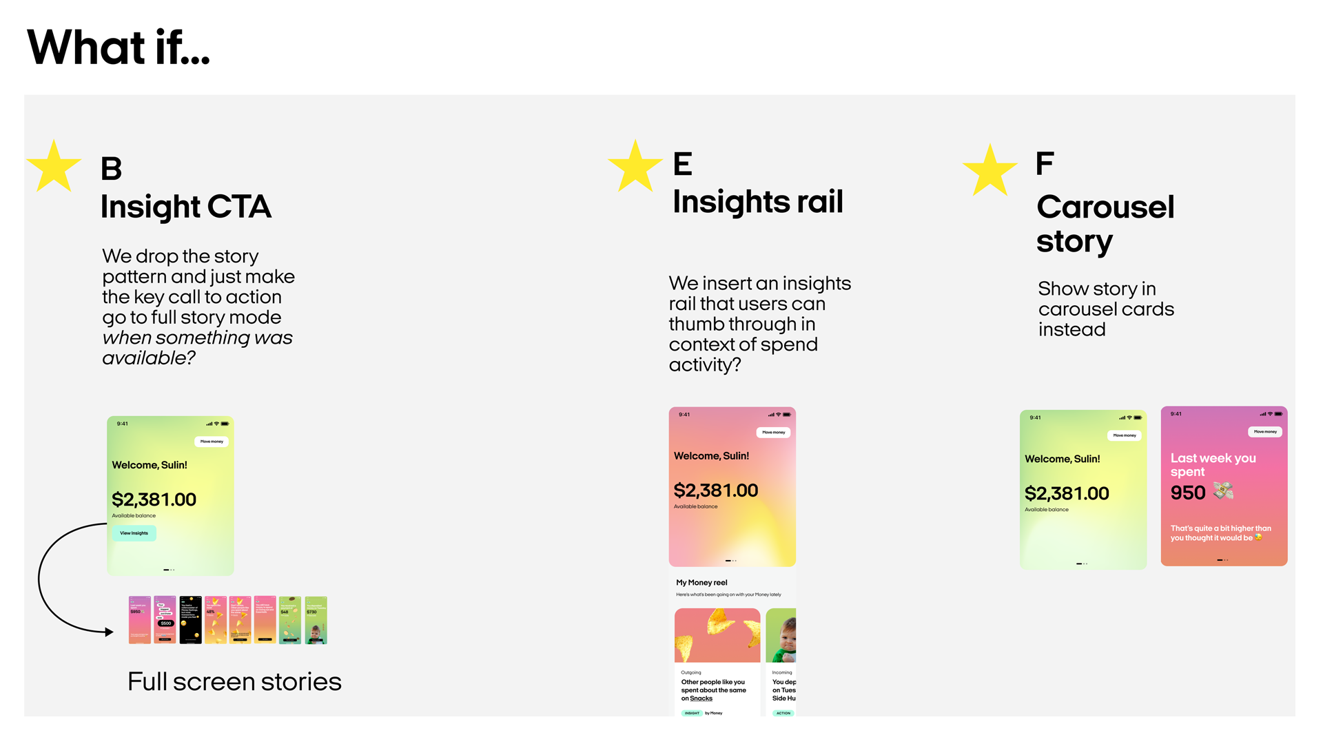
With the tech stack frozen and a pilot clock already running, we had room for exactly one differentiator. Advanced components, nice-to-have flows, and even a proper CMS for the content-led feature stayed on the cutting-room floor.
We bet the launch on the slimmest differentiator we could ship and deferred the rest. We cut back to the critical set below.
What I’d change next time
We sat in the middle; too strategic for “just UX,” not high enough to shape portfolio bets. Next time, I’d make the project’s intended impact explicit from day one.
-
Design around time to insight, not time to a mission statement.
Treat the work as a probe that quickly surfaces what’s true in the market. -
Use faster market signal as the success test.
Judge progress by how quickly we can see real shifts in trust and intent to try, not by how complete the future vision looks. -
Aim for a tighter story and a smaller research bill.
Strip the scope back to what directly serves the decisions to make; fewer concepts, clearer narrative, and only the research needed to back it.
Team composition
Our team
- Experience design lead
- UX and UI designers
- Strategists
- Researchers
Afterpay’s team
- Product managers
- Product marketers
- Product design teams
- User researchers
- Engineering teams
- Associated teams primarily focused on the BNPL business